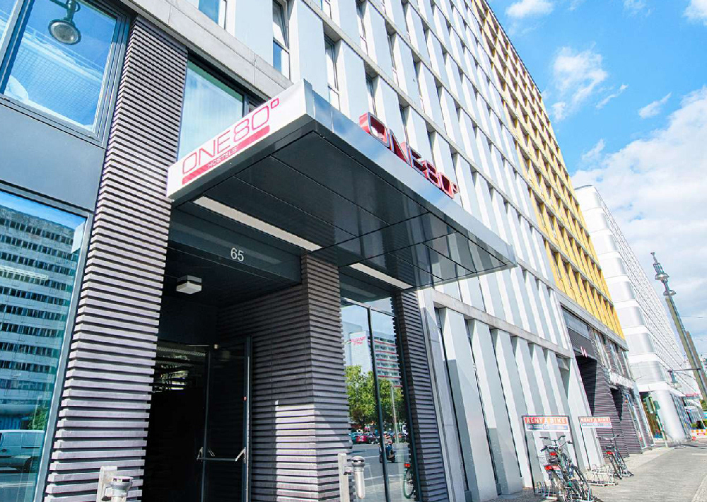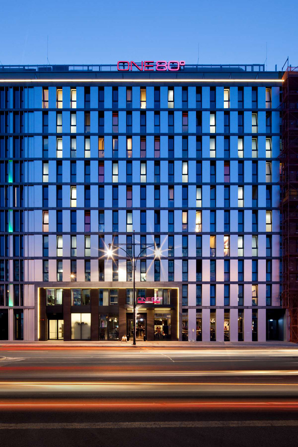
Client: ONE80 HOSTLE
The challenge was to produce branding for a hostel in the centre of Berlin with a boutique and stylish feel, which would appeal to a young audience.
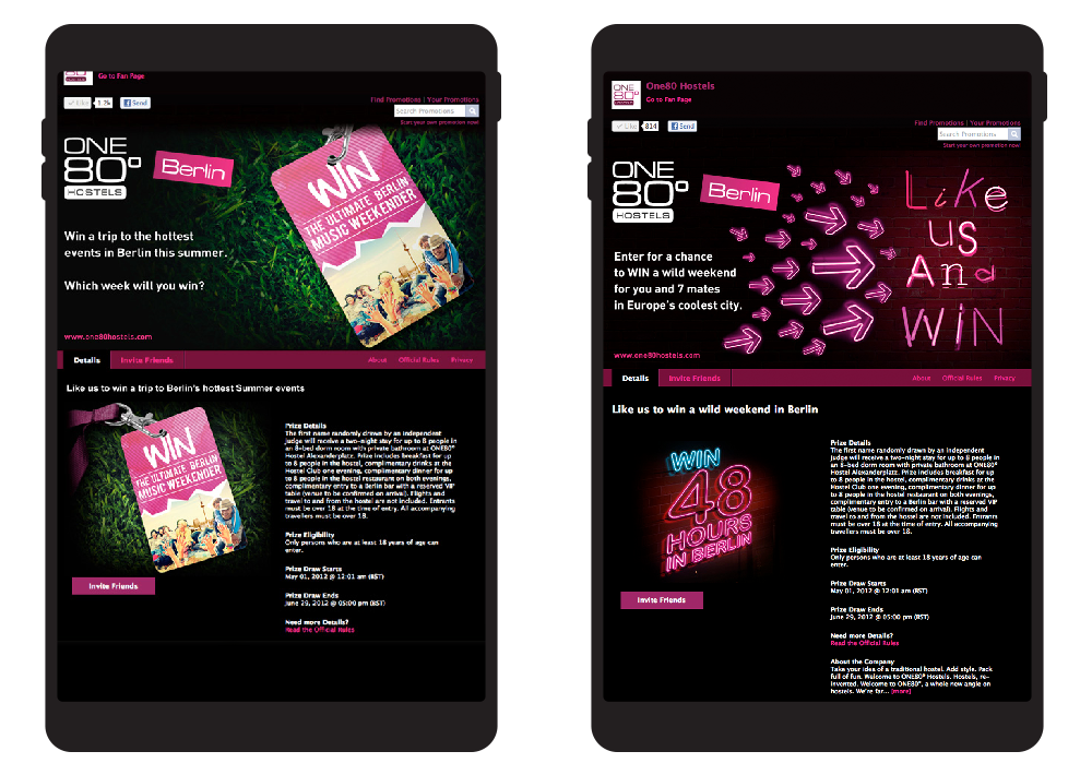
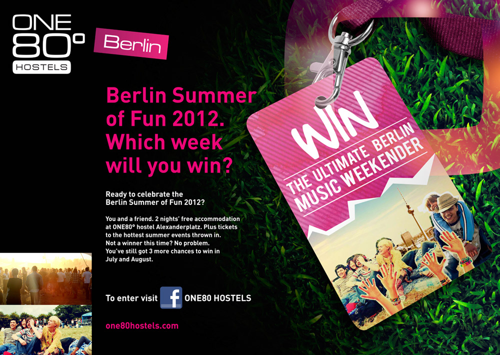
While brainstorming and developing names for the hostel the client loved the name ONE80°, as they liked the idea that you got a great view of the city, even the alternative peripherals. After looking at many variants we settled on a typographical logo that was bold and solid like the hostel’s building. To give the logo depth and impact we used a vivid, hot pink graduation.
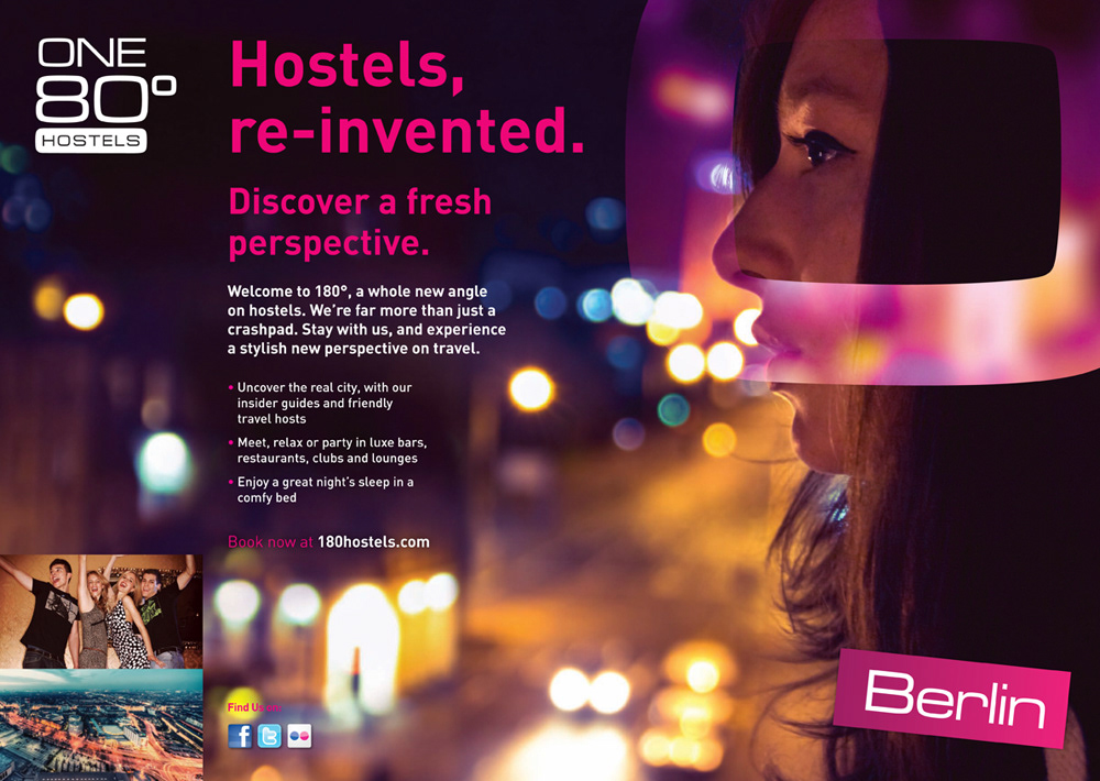
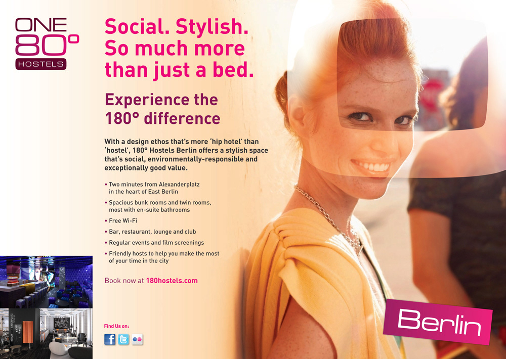
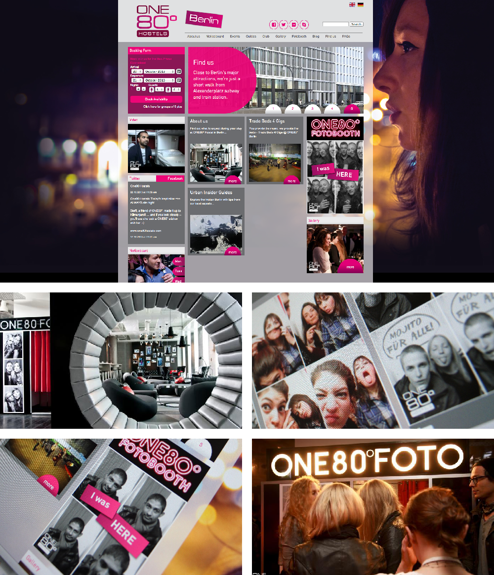
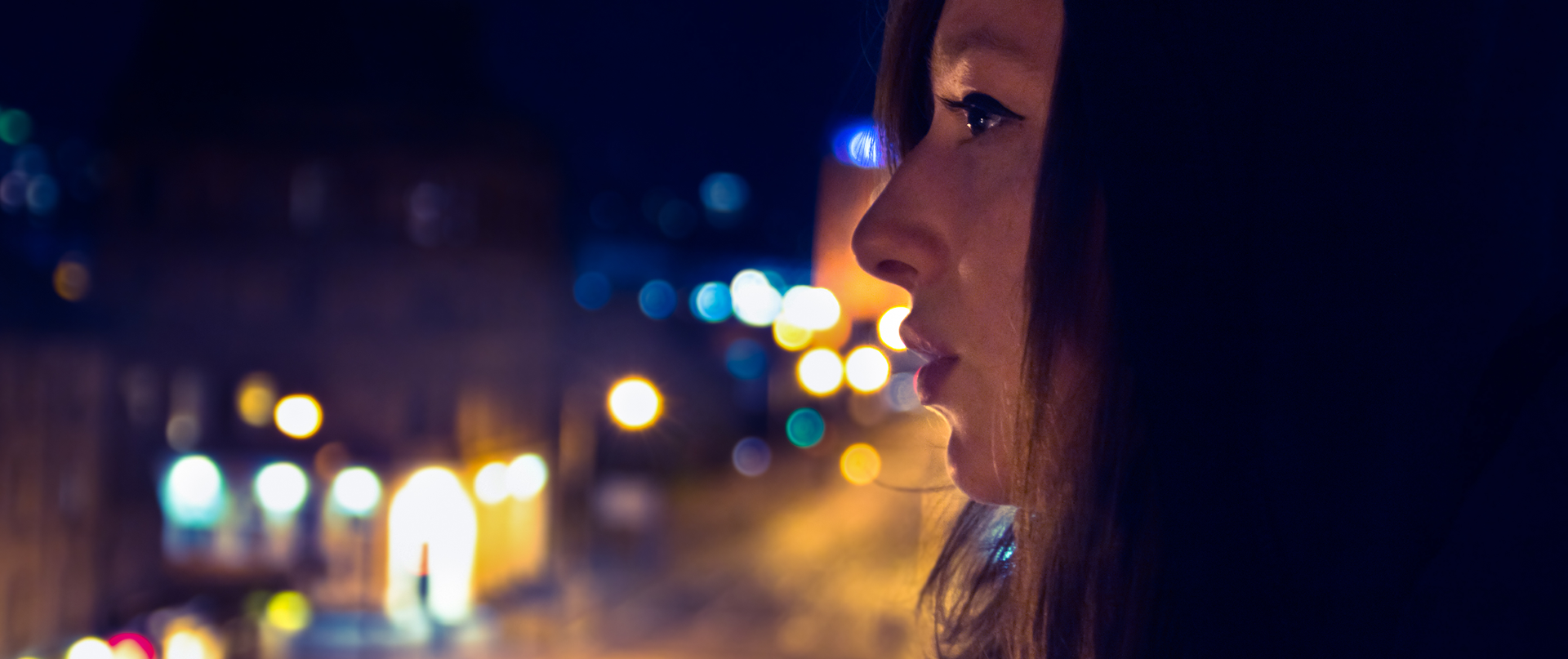
To complete the brand, photography was a very important tool in setting the right mood. After a lot of searching for the hero image, I found a photographer on Flickr who did great reportage street photography in Glasgow: his image of a young woman looking over the twinkling city from her window was perfect. This image was used as the background for the print and digital executions and made the logo’s colours punch through the moody night sky. ONE80° won the Award of Excellence from HostelBookers, recognizing it for Best Newcomer. The content-lead social core of the website has gone from strength to strength with blogs, tweets and the ONE80° photo booth.
Role: Art Direction, Graphic Design